
When words start working too hard, it’s time for a visual. Some concepts like workflows, hierarchies, and layouts become clearer the moment they are shown instead of explained. A simple diagram can replace a page of dense text with instant understanding.
Why It Matters for Product Teams
Documentation isn’t just read. It’s used. When users can see what to do, they move faster and make fewer mistakes. Visuals reduce cognitive load, speed up onboarding, and cut support back and forth. They also help non native readers follow complex ideas without struggling through long explanations. One clear sketch often does the work of five paragraphs.
How to Apply It
If a sentence feels complex, pause and ask whether a diagram would explain it faster. Use flowcharts for sequences and journeys, tables for comparisons, and screenshots for interfaces and UI behaviour. Label every visual clearly and reference it directly in the text so readers know when and why to look. Keep visuals simple, prioritising clarity over polish, and make them accessible with captions, alt text, and sufficient contrast.
Examples
Not Effective:
If a user forgets their password, they must request a reset, wait for an email, follow the instructions to create a new password, and then return to the login screen to access their account again.
Effective:

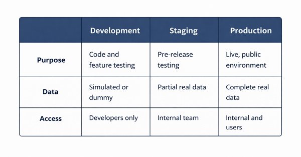
Not Effective:
Compare the three deployment environments to understand which permissions apply.
If it’s hard to describe, sketch it. A clear image saves your reader time and saves your words from doing the wrong kind of work.